


Keyboard - Neon Love Theme
4.840.00 Reviews
App Specs
- Version
- 1.4.8
- Updated On
- License
- Free
- Downloads
- 1,000,000+
- Developer
- akmobile
- Categories
- Personalization
- Platform
- Android
Screenshots
 Analysis by AppCompare
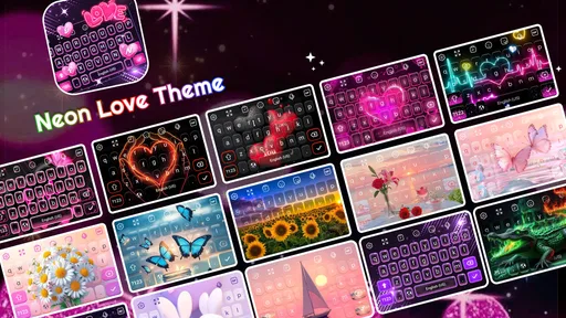
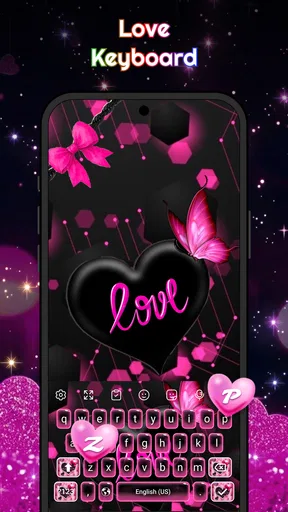
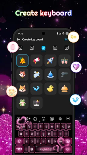
If you want your phone’s typing area to feel more personal, Keyboard - Neon Love Theme takes a very direct approach: it turns the keyboard into a pink, glowing design built around hearts, decorative fonts and expressive symbols. I reviewed it as a personalization app from akmobile, and my first impression was that it is aimed less at changing how you type and more at changing how typing feels. The result is playful, noticeable and easy to understand, especially if your current keyboard looks plain.
The app is free to install and suitable for Everyone, which makes it approachable for casual users who simply want a romantic or colorful keyboard style. It has already passed the one-million-install mark and holds a 4.8 average from roughly 4.1 thousand ratings, so there is clear interest in this particular look. That popularity does not make it perfect, though. A themed keyboard has to balance appearance with comfort, speed and trust, and those practical details matter more than the preview image once you use it in real conversations.
What the neon love keyboard is really for
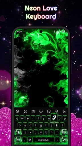
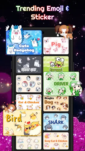
The best way to understand this app is to see it as a visual layer for everyday typing. It is not trying to replace every tool on your phone. Instead, it gives you a strong pink neon identity, with heart-focused themes, fonts, emojis and glow effects designed to make messages feel more expressive. If you like matching your phone to your personality, this is much more interesting than a static wallpaper because the design appears in a place you use repeatedly.
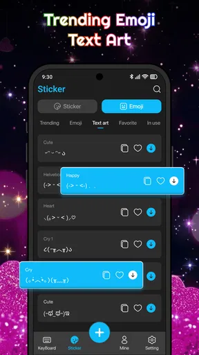
I can see it working particularly well for someone who enjoys romantic aesthetics, bright colors or customized social messages. It also suits users who frequently send short texts, captions or replies where emojis and decorative lettering add a little character. A simple “good morning” message looks different when the keyboard itself reinforces the mood, and that visual consistency is the main reason to choose this app over a standard keyboard theme.
At the same time, I would not recommend installing it solely because you want the fastest possible typing experience. The central appeal is style. People who prefer muted interfaces, compact layouts or a keyboard that disappears into the background may find the pink glow distracting rather than charming. The same is true if you spend most of your day writing long emails or documents and want a restrained, work-focused appearance.
The app is currently at version 1.4.8 and supports Android 7.0 or later. That gives it a fairly broad reach for users with older compatible devices, while people on newer phones should still judge it by how comfortable the keyboard feels on their particular screen. Different display sizes, brightness settings and system text preferences can change how a vivid theme looks in practice.
What I noticed before typing
The visual concept is clear immediately. Pink, hearts and glow are not hidden behind an elaborate identity, so you know what kind of experience you are getting before spending time customizing anything. That clarity is useful for a first-time user: there is no need to learn a complicated editing system just to understand the app’s purpose.
Worth Reading Before You Choose

EA SPORTS FC Mobile 26 Is a Bigger Football Game, but It Takes Time

Flipboard Shows What News Apps Must Do Beyond the Feed

Switching to Android Auto Means Rethinking Your Driving Routine
Google Calendar Makes a Crowded Week Easier to Manage
Ludo King Makes the Most of the Minutes Between Plans

Baby Panda World Brings Quick Play to Modern Phones, but Its Game Library Feels Busy
My advice is to decide whether you want a decorative keyboard everywhere or only during casual conversations. A strong theme can be fun in messaging apps but less suitable when entering passwords, filling out forms or writing something formal. Thinking about that distinction early prevents disappointment. You are not choosing a new wallpaper; you are changing a tool that appears in many different contexts.
Getting through the first setup
The first meaningful goal should be simple: install the app, activate its keyboard option through the normal Android keyboard settings, select the neon love design and test it in a harmless text field. I recommend using a notes screen or a draft message rather than immediately composing something important. That gives you time to check the key size, symbol placement, visibility and overall comfort without pressure.
When Android asks you to manage keyboard choices, read each screen carefully and select the option that belongs to this app. Keyboard setup can feel more serious than installing a wallpaper because the keyboard is involved whenever you enter text. That is normal. I would never rush through system prompts just to reach the theme, and I suggest keeping your familiar keyboard available until you are satisfied with the new one.
A practical first check is switching between keyboards while the text field is open. This helps you confirm that the new layout is active and gives you an easy fallback if the design does not suit a particular task. It also answers an important question early: can you return to your usual keyboard without searching through settings? If the answer is yes, experimenting becomes much less stressful.
Once the theme appears, type a short sentence containing ordinary letters, punctuation, an emoji and a number. This small test reveals more than looking at the theme preview. You will notice whether the glow makes the characters easy to read, whether the punctuation key is where your fingers expect it and whether the emoji access feels convenient. Those details determine whether the app becomes part of your routine or remains an occasional novelty.
Because the app includes in-app purchases ranging from $0.49 to $9.49 per item, I would also take a moment to understand which optional choices are free and which require payment before selecting anything extra. The free starting point is enough to judge the basic idea. My approach is to use the default experience for a day first, then decide whether additional decorative options genuinely improve the way I use the keyboard.
How to reach a first successful result
Your first success should not be “the keyboard opened.” It should be sending or saving a message that feels better because of the new design. Try a short personal note to a friend, add an emoji that matches the pink theme and compare the result with your normal keyboard. If the visual style makes you smile without slowing you down, the app is doing what it needs to do.
One useful workflow is to create a small set of go-to expressions for different moods. You might use hearts for affectionate messages, decorative letters for a social caption and ordinary typing for practical conversations. This keeps the theme from becoming repetitive and lets you decide when the extra personality helps. The keyboard does not need to dominate every message to be worthwhile.
I also suggest testing it in at least two apps with different text fields. A messaging app may feel comfortable, while a search box or form may expose a layout issue you did not notice. This is not a criticism unique to this product; keyboards interact with the surrounding app, and the available space can change. Still, it is an important part of deciding whether the neon design works for your actual routine rather than just for a screenshot.
For people who use emojis heavily, the themed approach can make quick conversations more enjoyable. For people who rarely use emojis and type mostly long sentences, the decorative elements may offer less practical value. That is the key trade-off: the app adds emotional color, but it does not automatically make typing more efficient.
Confusions that can make the app feel harder than it is
The first common confusion is expecting the theme to change every part of the phone. It changes the keyboard experience, not the entire device interface. Your home screen, notification panel and other apps will not necessarily adopt the same pink neon appearance. Once you treat it as a focused keyboard customization tool, its scope makes more sense.
Another point that can surprise new users is that installing the app and using its keyboard are separate steps. The design may not appear simply because the app is present on the phone. You usually need to select the keyboard through the system’s input settings or keyboard switcher. If nothing changes in a message field, check the active keyboard rather than repeatedly reinstalling the app.
There is also a difference between a font effect and a font used in the text that another person receives. Decorative keyboard lettering may affect what you enter or how the keyboard looks, but the recipient’s app and device ultimately determine how text is displayed. I would test a decorative character in a low-stakes message first. If a friend sees an unusual symbol or spacing, you will know whether that style is suitable for wider sharing.
Glow effects can create another small issue: visibility depends on brightness and surroundings. A vivid keyboard may look attractive in a dim room but feel intense outdoors, or the reverse. I found it useful to judge the keys at the brightness level I normally use instead of relying on a preview. If you type late at night, a bright design may also make the keyboard more visually prominent than you want.
Finally, remember that a themed keyboard is still a keyboard. Autocorrection habits, swipe behavior, punctuation access and key spacing deserve the same attention as the colors. If a particular feature matters to you, test it directly rather than assuming the heart design guarantees the same behavior as your previous keyboard. A beautiful layout is not a good trade if it causes frequent corrections during important messages.
Where it fits in everyday use
Imagine finishing a long day and sending a quick message to someone close to you. You open the chat, the pink glow appears, you add a heart and send a short note without needing to search for a separate sticker or image. That is the kind of everyday moment where this app makes sense. It adds atmosphere to a routine action without asking you to redesign the rest of your phone.
It can also be useful for people who enjoy rotating themes with their mood. A romantic keyboard may fit a special occasion, a personal journal entry or a playful conversation, then be replaced temporarily by a more neutral option for work. The ability to treat the design as a mood choice rather than a permanent commitment is one of the app’s strongest practical advantages.
For content creators who write short social captions, the combination of fonts, emojis and visual styling may help brainstorm a distinct tone. I would still review every caption before posting, because decorative characters can affect readability and may not look identical everywhere. The app is better as a creative aid than as a guarantee that every recipient will see exactly the same typography.
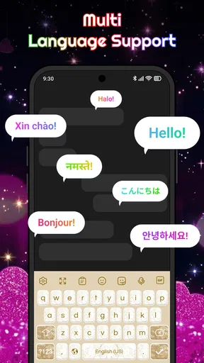
Compared with a plain system keyboard, the difference is obvious: this app wins on personality and visual presence. Compared with a full-featured mainstream keyboard, the comparison is less straightforward. A general-purpose keyboard may be a better choice if you prioritize advanced text tools, multilingual workflows, extensive prediction or a highly familiar layout. Keyboard - Neon Love Theme is the more appealing option when the look itself is part of the experience.
Privacy-conscious users should approach any third-party keyboard thoughtfully. A keyboard is present while you type sensitive information, so I recommend reading Android’s prompts and choosing carefully whether to use it for private or financial text. Keeping your regular keyboard installed as an alternative is sensible. That is not a reason to dismiss the app, but it is a responsible habit whenever you add a new input method.
Who should use it, and who should skip it
I would recommend it to someone who wants a free starting point for a pink, heart-centered keyboard and enjoys visible customization. It is especially suitable for casual messaging, emoji-heavy conversations and users who see their phone as an extension of their style. The Everyone rating also makes it approachable for a broad audience, although personal taste still matters more than the age label here.
I would be more cautious if you need a keyboard for professional writing, accessibility-focused clarity or intensive multilingual typing. In those situations, a neutral keyboard with tools designed around speed and legibility may serve you better. The neon look can remain fun for personal chats, but it should not replace a dependable option if your work depends on fast, accurate text entry.
There is also a good reason not to buy optional content immediately. Use the free experience long enough to learn whether the colors, key arrangement and decorative choices fit your hands. If you keep returning to the theme and want more variety, an in-app purchase may feel worthwhile. If you stop using it after a few messages, you have avoided paying for customization that did not improve your routine.
My overall impression is positive because the app knows exactly what it wants to be. It does not need a complicated concept to deliver a recognizable change: it makes typing feel more romantic, colorful and playful. The limitations are equally clear. It is not the best answer for every writing task, and the strongest visual effects may not suit every setting or user.
After testing the setup path, my recommended next step is to keep your normal keyboard available, try the neon design in two or three everyday conversations and judge it by comfort rather than appearance alone. Check punctuation, emojis, longer sentences and the way decorative text appears after sending. If those tests feel natural, this personalization app can make ordinary messages more enjoyable.
My final recommendation is simple: choose it for mood, color and expressive messaging, not because you expect a complete productivity keyboard. From akmobile, it offers a focused way to give Android typing a pink neon identity, and its free entry point makes trying that identity easy. Just keep your expectations realistic, protect your fallback keyboard and decide on paid extras only after the basic experience has earned a place in your daily routine.
Pros
- Bright neon design gives the keyboard a lively
- eye-catching appearance.
- Theme can personalize a standard keyboard without changing your device launcher.
- Lightweight customization is suitable for users who prefer simple visual tweaks.
- Love-inspired colors work well for romantic or playful phone setups.
- Easy to remove if you want to return to your default keyboard style.
Cons
- Neon colors may reduce readability in bright outdoor conditions.
- The romantic design may not suit professional or minimalist devices.
- Theme compatibility can vary between keyboard apps and Android versions.
- Some features may require installing a companion keyboard application.
- Animated or bright visuals could feel distracting during extended typing.
FAQs for Keyboard - Neon Love Theme
What is Keyboard - Neon Love Theme?
Keyboard - Neon Love Theme is a decorative keyboard customization app designed to give your phone a colorful, romantic appearance. It typically adds a neon-inspired love background, themed keys, and matching visual effects to your typing experience. The app is mainly intended for users who want their keyboard to look more stylish and personalized rather than those seeking advanced productivity or typing features.
How do I install and activate the Neon Love keyboard theme?
After downloading Keyboard - Neon Love Theme, you generally need to open the app and follow its setup instructions. These may include enabling the associated keyboard in your device’s keyboard settings and selecting it as the active input method. The exact steps can vary between Android versions and phone manufacturers, so check the on-screen guidance carefully before confirming the theme.
Is Keyboard - Neon Love Theme compatible with my phone?
Compatibility depends on the version of Android or iOS supported by the application and on how the developer has implemented the keyboard. Before installing, review the store listing for supported operating systems, device requirements, and recent update information. Some visual effects, emojis, fonts, or keyboard functions may work differently depending on your phone model, screen size, and system settings.
Is it safe to use a third-party keyboard like Neon Love Theme?
A third-party keyboard can process the text you type, so privacy should be considered before activation. Download the app only from an official store, check the developer information, read recent user reviews, and examine the permissions requested. Avoid entering highly sensitive information until you understand the app’s privacy policy, data practices, and whether it offers a trustworthy reputation.
Does Keyboard - Neon Love Theme cost money or contain advertisements?
The availability and pricing model can vary by version and platform. Keyboard - Neon Love Theme may be free to download while displaying advertisements, offering optional purchases, or including additional themes and features behind a payment. Check the current store page before downloading because prices, subscriptions, advertising policies, and included features can change after updates or differ between Android and iOS.


